The Design of Money
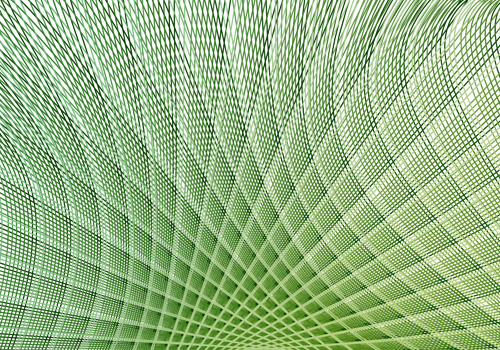
Aegir Hallmundur from the Ministry of Type has a fascinating article on the math that goes into making geometric patterns on currency. The math is definitely way above my head, but it’s interesting to think about the detail that goes into making money look the way it does — including anti-counterfeiting ‘flaws’ that are introduced into the patterns.
This got me tinking a little more about all of the techniques that go into making money more difficult to counterfeit — and counterfeiting in general. As color printing has evolved, it’s become harder and harder for the Treasury to make bills with details that could not be replicated when the bills were scanned and printed. To help curtail counterfeiting, I know that the Treasury has worked with printer manufacturers and providers of image editing software to make sure their technology doesn’t allow users free reign to make high-quality fake currency.
You learn all sorts of fun facts when you start digging into this stuff. A friend of the family who works as a consultant to the Treasury Department on anti-counterfeiting once told us just how many points of reference there are in a banknote. I can’t remember precisely how many, but it’s a lot. She also said that nearly all $100 bills in circulation have traces of cocaine on them.
Fascinating.
More fun currency morsels:
- Browse through Wikipedia for more on counterfeiting
- Read up on how to detect fake currency from the source – the Secret Service
- Visit Crane’s Paper — providers of US Currency paper for over 200 years
- Check out the Bureau of Engraving’s initiative to redesign US Currency
Tags: Counterfeiting, Currency, Math
