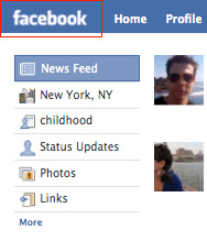
I know Facebook has done some tweaking of their UI lately (most notably to get rid of those spiffy, but apparently very difficult to maintain, rounded corners on the pictures), but they seem to be getting a little careless in terms of what gets out to production. Working for a large company myself, I know sometimes things can accidentally come out of the oven a little before they’re cooked. I’m just surprised to see this from Facebook.
Check this out:
1. The logo is blurry. Maybe they’re trying to reduce the file size? But man. I think that’s a no-no. Maybe it’s worth the extra K or two to have the logo be sharp?

2. The borders on all of their photos in the (freaking annoying) Highlights section are totally out of whack:

Come on Facebook! Pull yourself together! It’s not the weekend yet! Put down the margarita, re-save your logo, tweak your CSS and THEN you can leave for your rafting trip. K?


